Turners
Case Study
Turners wanted a major redesign of its motor vehicle insurance systems and processes, including an investigation of ways in which the introduction of new technologies can enhance the buyer experience.
This was a project that I did at Mission Ready as part of my course and wasn’t used for turners actual website.
OVERVIEW
UX Designer
User Research, Visual design, Prototyping & Testing
July 2023 - September 2023
ROLE
Background
For the initial research of the project I worked in a team of 4 to go through the define stage of the design thinking practices. The rest of the project I championed the User interviews, Wireframing, Prototyping, User testing and Reporting
Here are some key achievements for this project:
Turned an idea into a product. The ability to transform an idea into something much more tangible is a process that is both exhilarating and rewarding. This was my first ever UX project and while the product will not be released to the public, being able to see how much I have grown as a UX desginer is truly sensational.
Juggled many different hats. Working as an all-in-one designer is not easy. I dedicated hours of my spare time and weekends conducting research, sketching, testing and designing the product, alongside creating pitch deck presentations and filling out grant applications for the business and marketing side of the business.
Pitched to investors and crowds. I developed skills in not only designing our pitches but also presenting them to investors and large crowds in our “show and tell” classes where there would be up to 30 people at a time.
Understanding The Problem
After conducting user interviews, we discovered the following top frustrations:
Didn’t know Turners’ insurance process took so long(back and forth). Users were surprised by the extended back-and-forth process involved in Turners’ insurance process. They had no idea it would take such a long time to complete the processes as you had to go into a car yard to complete the purchase.
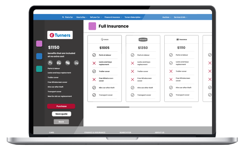
Customers found it hard to compare insurance. Users would have a hard time trying to compare quotes as it would not list what is coved and what is not.
Website lacks functionality. Users found it frustrating that you could not purchase or get a quote online.
Based on our research, we recognized that there were two key user types that our product tried to solve problems for.
User Personas
Customer Journey
We created a customer journey map to build a better understanding of how customers find and interact with the service and to discover opportunities for improvement. The map revealed many user problems and opportunities at the consideration and purchase stages of the customer journey.
‘As a customer I want to be able to buy and compare insurance online
so that I have more time to complete other tasks in my day.’
Defining the problem statement
After gathering the findings from the research, I worked with the team to define the problem statement.
Problem statement:
“People who are seeking to purchase and compare Motor insurance at Turners are required to go in-store to purchase and get a quote. Customers who want to buy or get a quote have to go to a store where staff need to assist them in the process because customers are unable to do this online. This is frustrating and time consuming for both customers and staff.”
We convened with our development team, engaging in a dynamic "Crazy 8" brainstorming session. Subsequently, we engaged in a collaborative voting process to identify the most promising ideas we had generated.
Ideation
User Flow
My goal is to design a user-friendly, step-by-step website that streamlines the process of obtaining and purchasing car insurance at Turners. Additionally, I aim to incorporate a robust comparison feature to enhance the user experience and aid in making informed insurance decisions.

Wireframes & Prototype
I designed the high-fidelity wireframes to serve as a rapid prototype, given my time constraints. Subsequently, I utilised this prototype for conducting usability testing.
Usability Testing
I conducted the usability test to find out where and how I could improve my design. I asked users to perform 4 tasks and gathered their findings into a usability report and created a severity rating on the problems that where found
Key Takeaways
Users generally found the process of buying insurance easy, but they expressed a desire for more information, images and an early display of costs when comparing different packages.
Users really liked the quote comparison part of the website, finding it effective and user-friendly.
The website's current approach was seen as less administrative and more user-friendly, but some aspects require further testing and refinement due to wireframe limitations.
Final Designs
Mobile
Desktop
Outcomes
Implemented efficient measures that significantly reduced the amount of time customers spent searching for and acquiring the most suitable insurance options.
Customers found it incredibly convenient to obtain car insurance and were confident that they were securing the most advantageous deal available.


